Exploring a tense and delicate case involving child protection services within a minority community, “Fjord” delves into the danger of imposing worldviews and the complexity of social care. Shot in Norway across shifting seasons, the film employs a visual language that balances the breathtaking scale of the fjords with an intimate, observational atmosphere, capturing a story of profound human uncertainty and quiet intensity.
Could you describe your working relationship with director Cristian Mungiu?
I have known Cristian for a long time and over the years we have built a very specific visual language together. Our collaboration is based on trust and on a shared understanding of the core of the story he wants to tell. The script also usually gives us a very strong starting point. Most of the heavy lifting happens during prep and scouting, where we define the emotional logic of the film and the relationship between the characters and the locations.
Cristian is a director who wants to be absolutely truthful to what we are doing and also about the story itself. He is not interested in imposing an interpretation of reality; he wants reality itself. That approach shapes everything, from the way we stage scenes to the way the camera observes the characters. Because of our long-standing relationship, I can respond very quickly to what he wants, even when he describes a scene more in emotional terms than technical ones.
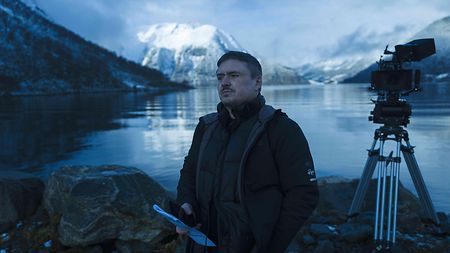
Director Cristian Mungiu on set.
When and where did the shooting take place?
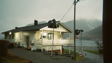
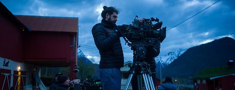
We shot in Norway. Since we were working without a massive budget, we had to be very efficient and flexible. We started prep in January and filmed through February, March, and April, managing to capture the feeling of three different seasons within just a few months. That required a lot of adaptability in scheduling locations, actors, and time of day. We were constantly looking for ways to find traces of winter, spring, and autumn within the same shooting period. The environment was beautiful, but it was also unpredictable, so the entire production had to stay responsive to changing conditions.
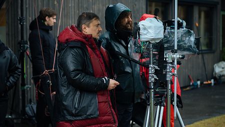
"The environment was beautiful, but it was also unpredictable, so the entire production had to stay responsive to changing conditions," says DP Tudor Panduru.
How did you approach the script and the visual palette of the movie?
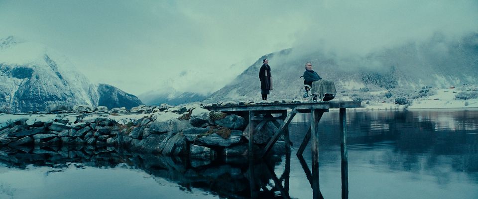
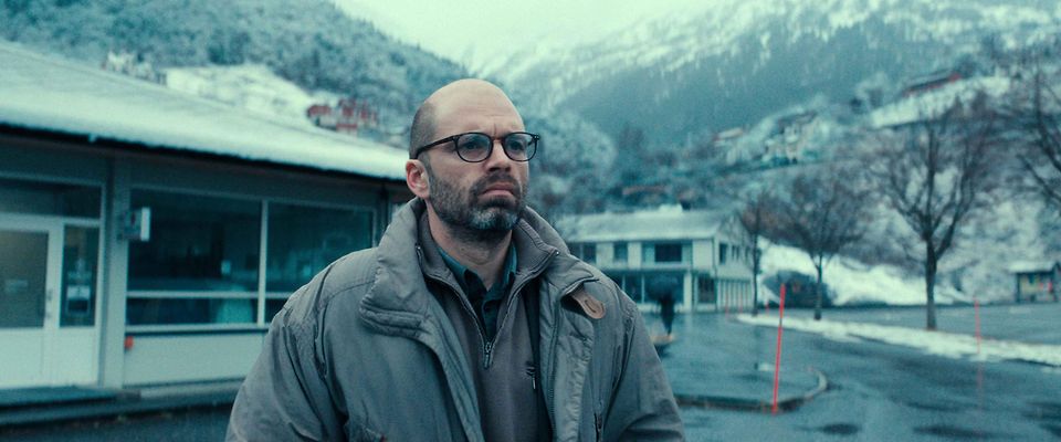
The visual language of the film emerged from the conversations we had during the scouting process. Rather than drawing inspiration from cinematic references, we allowed the locations themselves—and the reality of the world we were filming in—to shape our approach. When we arrived in Norway, we were immediately struck by the landscape and by the quality of the light. The sun stays very low there, unlike in Southern or Eastern Europe where it tends to sit much higher in the sky. That low angle creates a direction of light that is almost hypnotic.
We were also very interested in the contrast between the Norwegian environment and the architecture, especially the specific red of the houses and barns against the washed-out natural light. The film aims to create a constant sense of strangeness, uncertainty, and underlying danger, so the visual approach had to remain grounded while still carrying a layer of mystery.
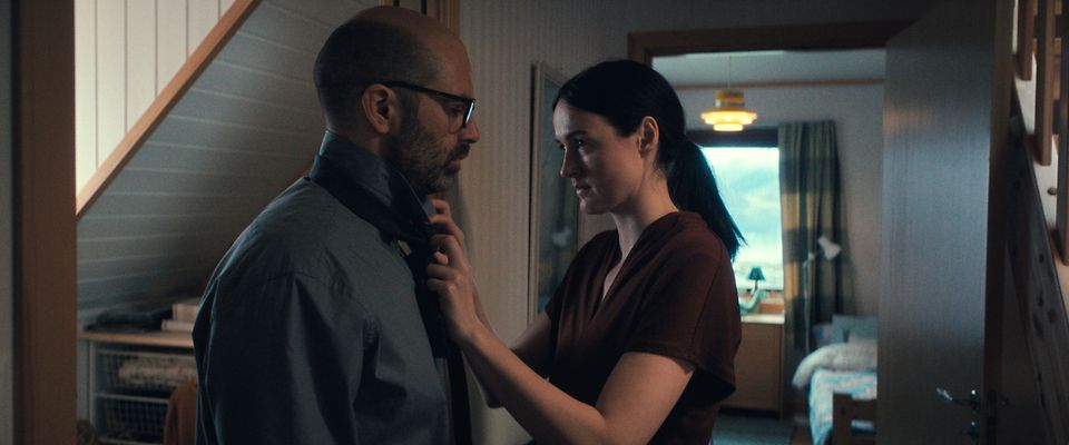
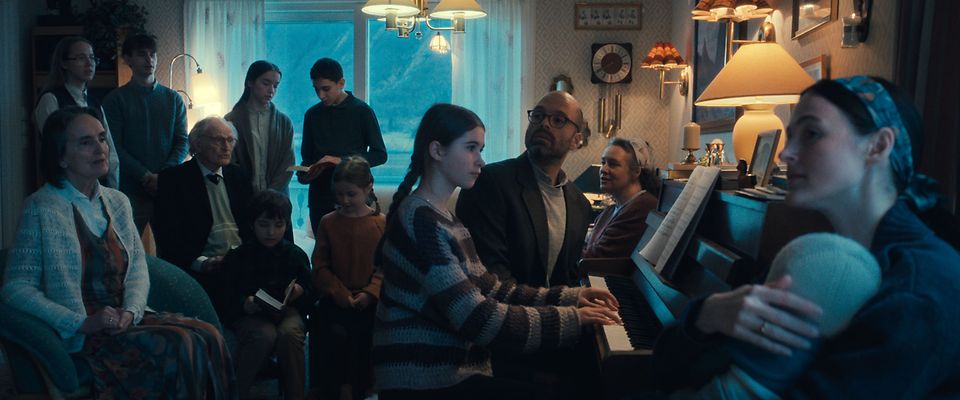
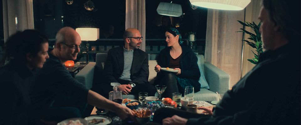
From a chromatic point of view, we built a palette that is cold and desaturated, but still preserves the brilliance of primary colors. We also tried to subtly distinguish the emotional worlds of the two families in the story. The exteriors have a colder, more metallic feeling, whereas the interiors are warmer and more intimate, creating a quiet contrast between spaces and relationships.
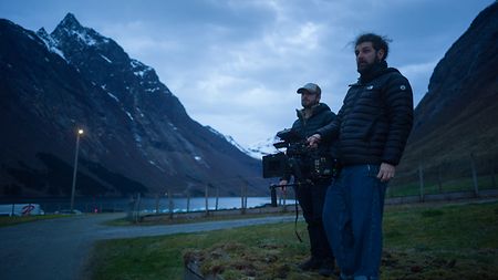
DP Panduru explains how Norway’s landscape and low, hypnotic light shaped the film’s visual language, giving the exteriors a cold, almost metallic quality—and a sense of mystery and unease.
What was your general cinematographic approach on set?
The film maintains an observational, non-judgmental perspective. We wanted the camera to stay emotionally connected to the characters without ever forcing a narrative point of view onto the audience. Even in moments of great emotional intensity, the framing remains restrained, thoughtful, and human.
Most scenes were built around master shots, with careful variations in framing and rhythm so that the visual information never felt repetitive. The camera is mostly handheld and breathes with the action, but always in a controlled and naturalistic way. The goal was never to stylize for its own sake, but to support the truth of the moment.
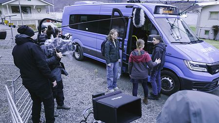
DP Panduru explains how shooting handheld with the ALEXA 35 kept the camera close to the characters—moving with the action while maintaining a restrained, naturalistic feel.
Why did you choose the ALEXA 35?
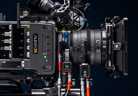
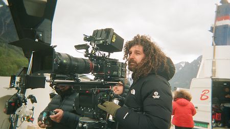
The ALEXA 35 was essential for this film because it allowed us to stay truthful to the locations while still maintaining the level of control we needed. Norway presented very demanding contrasts, especially between bright skies, reflective surfaces, and darker interiors, and the camera’s dynamic range gave us the confidence to work in a very natural way. DP Tudor Panduru with the ALEXA 35 on set, relying on the camera’s dynamic range and low-light performance to handle Norway’s extreme natural contrasts.
There was a barn scene where the contrast was so high that I was concerned about clipping, but the sensor held the highlights beautifully and also preserved depth and information across the image. I rated most of the film at EI 1600, because I felt very comfortable with the way the camera handled the lower part of the curve while protecting the highlights.
For one of the most difficult night sequences on the boat, I used the ALEXA 35 Enhanced Sensitivity mode at EI 3200. That gave us the flexibility we needed in a very challenging environment and allowed us to preserve the atmosphere of the scene without over-lighting it.
What was behind your lens choice?
We shot with ARRI Master Anamorphic lenses, which felt right for the film because of their organic image quality. They allowed us to stay close to reality while still giving the film a strong cinematic presence. That balance was very important for this story because the visual language had to feel grounded and immediate, but also rich in atmosphere.
The anamorphic image supported the scale of the Norwegian landscape while remaining intimate with the characters. It helped us preserve both the emotional distance and the human connection that the film required.
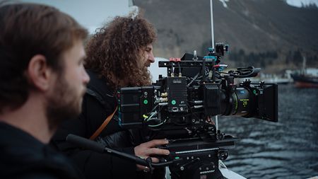
DP Tudor Panduru paired the ALEXA 35 with ARRI Master Anamorphic lenses to capture the scale of Norway’s landscapes while keeping the image organic, grounded, and intimate.