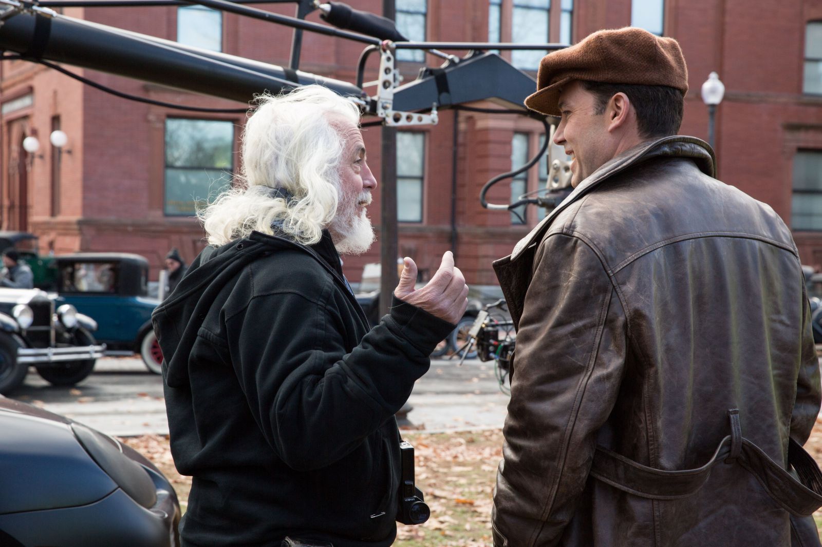
The results were graded by Yvan Lucas to attempt a near-match of all three and then shown to Ben at The Shed on a 4K screen. After viewing them several times we went into each of the three tests, blowing them up to analyze grain structure and determining if aggressive LUTs would have a positive or negative effect. Further, the test allowed me to determine ASA; I found that since I was shooting without lighting, a few of the interior shots were too far underexposed to register on film. The ALEXA was better but the ALEXA 65 was the best, and that is how we eventually decided on the ALEXA 65.
What visual approach did you and Ben take to the story and the period?
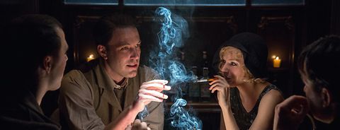
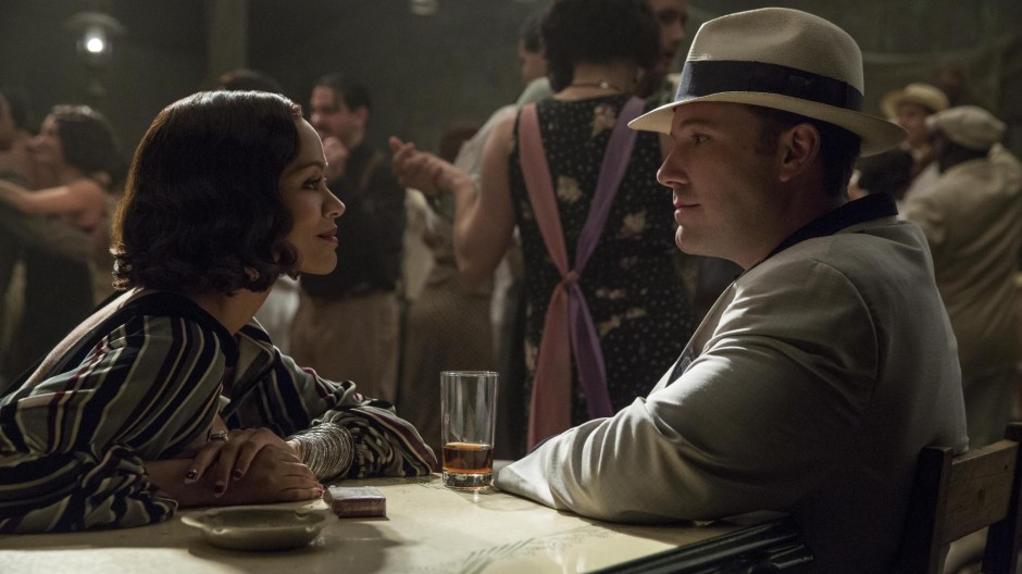
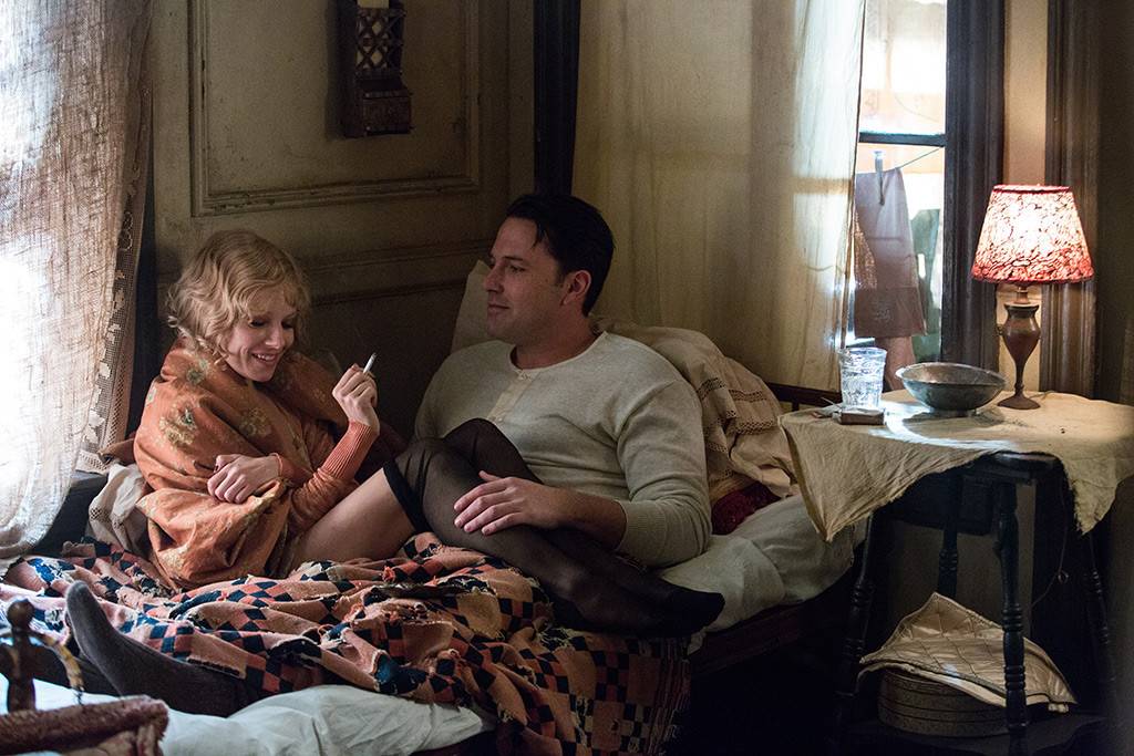
Our initial discussions on the visual approach were that Ben conceived of Boston as being less saturated, akin to a bleach bypass, with larger grain, a reduced palette and more black in the frame. Needless to say this is a simplistic description because some of the black would become tarnished; other colors such as blue played heavily and at times we moved to a deep yellow/orange for interiors.
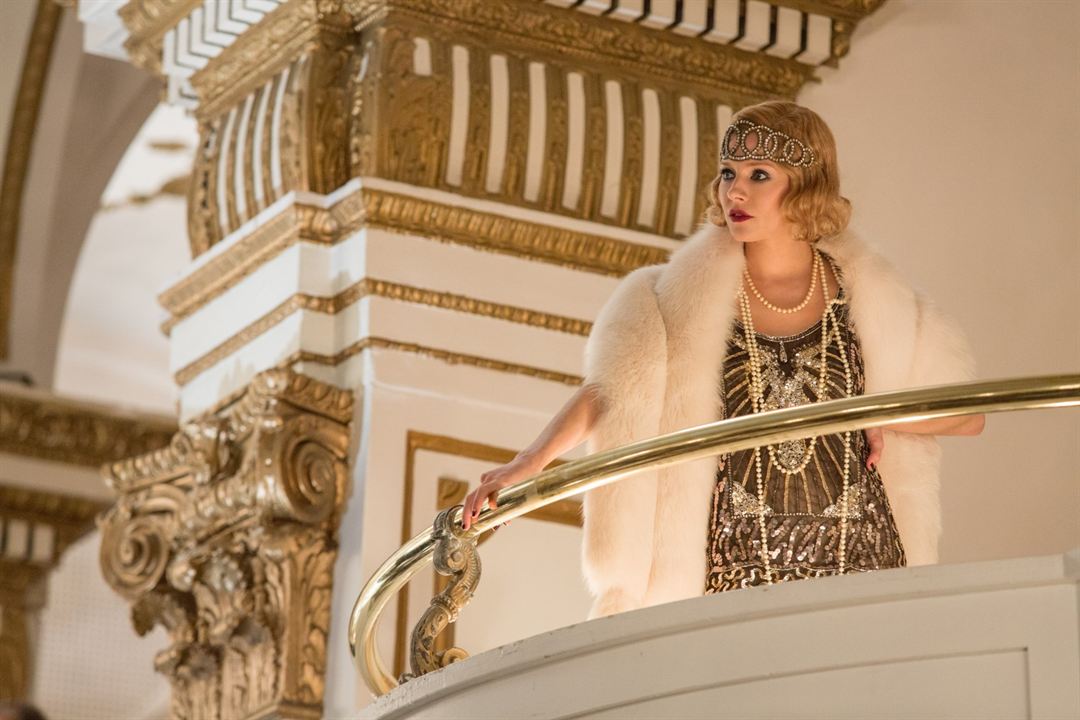
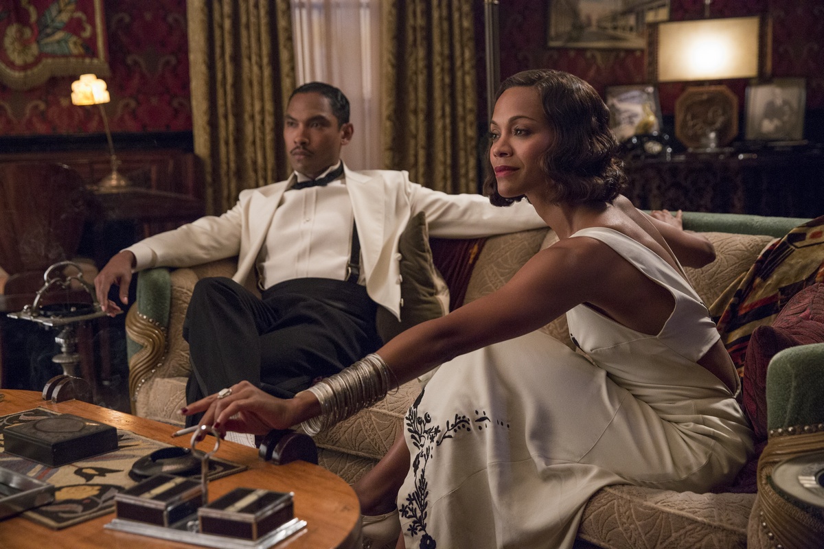
When the story shifted to Florida the palette of all departments opened wider -- colors in buildings as well as costumes, vehicles, makeup and art direction. This widening of color was slowly stripped away as the influence of Boston upon Florida became greater, with darker hues returning. In addition there was a desire to work with staging so that the scenes would not be covered in a conventional manner at all times; we moved towards complex staging to allow longer takes, while still capturing the dialogue appropriately.